Here you can explore our remarkable portfolio of diverse and inspiring endeavours. I take great pride in showcasing our range of projects, from architectural masterpieces that redefine spaces to innovative engineering solutions that push boundaries. Each project represents our commitment to excellence, creativity, and delivering outstanding results.
+ opera school
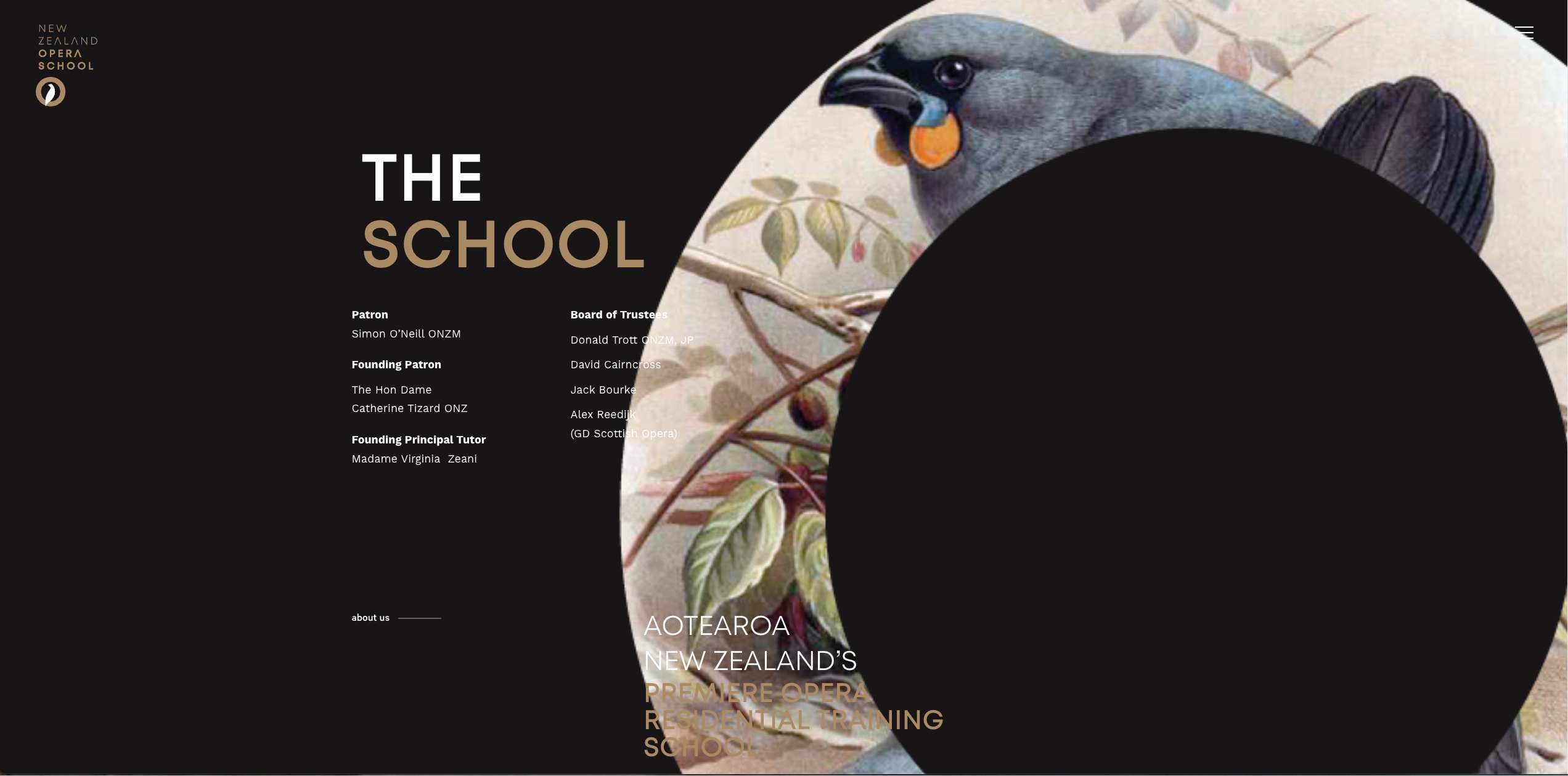
New Zealand Opera School is widely renowned for hosting annual Opera Schools in Whanganui. As a prominent institution in the field, their website required a much-needed redesign. The existing website had been built over a decade ago and had not undergone any revisions since then.
The newly redesigned version of the New Zealand Opera School website showcases an extensive collection of alumni from the past 25+ years of their annual school. Additionally, it highlights all the dedicated teachers who have contributed to the school's success over the years. The website also incorporates a comprehensive array of captivating photographs, capturing the essence and vibrancy of the Opera School.
Recognizing the significance of organic search visibility, special attention was given to search engine optimization (SEO). The website was meticulously optimized to ensure excellent coverage in organic search results, enhancing its discoverability and attracting a wider audience.
By combining the expertise of various professionals and incorporating modern design elements, the New Zealand Opera School's website underwent a remarkable transformation. The result is a visually captivating and technically efficient online platform that accurately reflects the school's legacy, achievements, and commitment to excellence in opera education.
note: this website was build while I was part of an agency.

+ bmtech
Web developer played a pivotal role in enhancing the BMtech website's user interface (UI) and user experience (UX), complementing the refreshed brand identity.
During the process of exploring various design options for the BMTech website, I proposed a paper-like background to establish an association with the specifications, reporting, and consultancy services provided by this esteemed engineering team. This creative choice aimed to convey a sense of professionalism and expertise, aligning with BMTech's core offerings.
The website was meticulously customized to reflect the BMTech branding style, including the incorporation of the company's colors, font selection, iconography, and page layouts. By harmonizing these elements, I ensured a cohesive and visually appealing online presence that resonated with BMTech's brand identity.
Furthermore, a robust SEO (Search Engine Optimization) strategy was implemented to bolster the website's online visibility.
note: this website was build while I was part of an agency.
+ fire ts lab
The team carefully considered the website layout and content structure to effectively convey the key business aspects, including laboratory testing standards, technical expertise, construction capabilities, and the arrangement of the SpeakUp Blog episodes to engage viewers. A comprehensive collection of professional photos taken by Justina Bain made showcasing the laboratory's sophisticated equipment and testing scope easier.
Arranging the testing scope, particularly focusing on the lab's main standard - AS1530.4 for fire resistance testing, was a more time-consuming task. This page prominently featured Cellulosic and hydrocarbon temperature curves derived from real fire resistance tests. Additionally, tunnel fire testing temperature curves were included.
The sections of AS1530.4 were presented from the perspective of the lab's technical capabilities to conduct tests, covering aspects such as frame dimensions, viewing window, loading procedures, and crane usage.
To enhance user experience, the buttons on the website were designed to visually resemble the passage of fire through the specimen lining during the test's culmination. These buttons also changed color on hover, providing a fluid and responsive feel to the website.
note: this website was build while I was part of an agency.